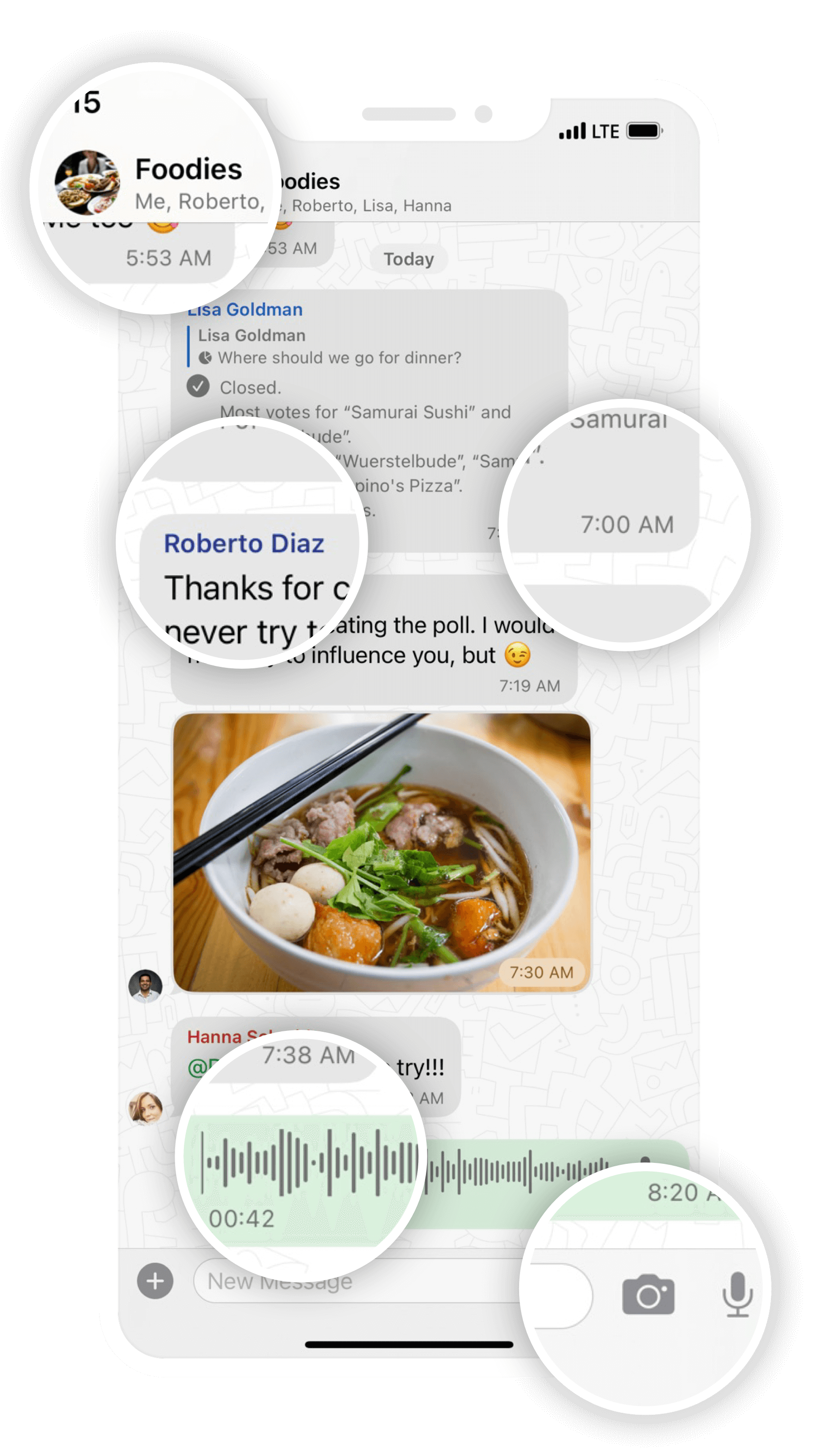
The visual modernization of Threema’s iOS app has been under way for some time now: Version 4.8 marked the start of the overhaul, introducing newly designed contact and group details along with various new features. With the 4.9 update, the chat overview received a redesign. As the grand finale, Threema 5.0 for iOS now gives the chat view a fresh and modern look.
What might seem like a simple redesign of UI elements is actually a fundamental revision of the underlying code: we’ve rebuilt the chat view and the process of loading messages from scratch. Not only has the user interface received a modern touch, but the performance when loading and scrolling through chats has also improved.

The elements we have revised and modernized in Threema 5.0 for iOS include the following:
- The title bar is now always visible and shows a contact’s name, profile picture, and verification level, as well as a call button. In group chats, the title bar includes the name, the group picture, and the members.
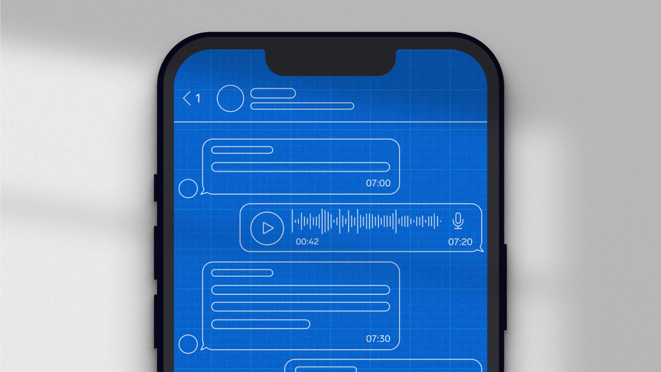
- Voice messages can be played directly in the chat. If there’s a subsequent voice message, it will be played automatically after the current one.
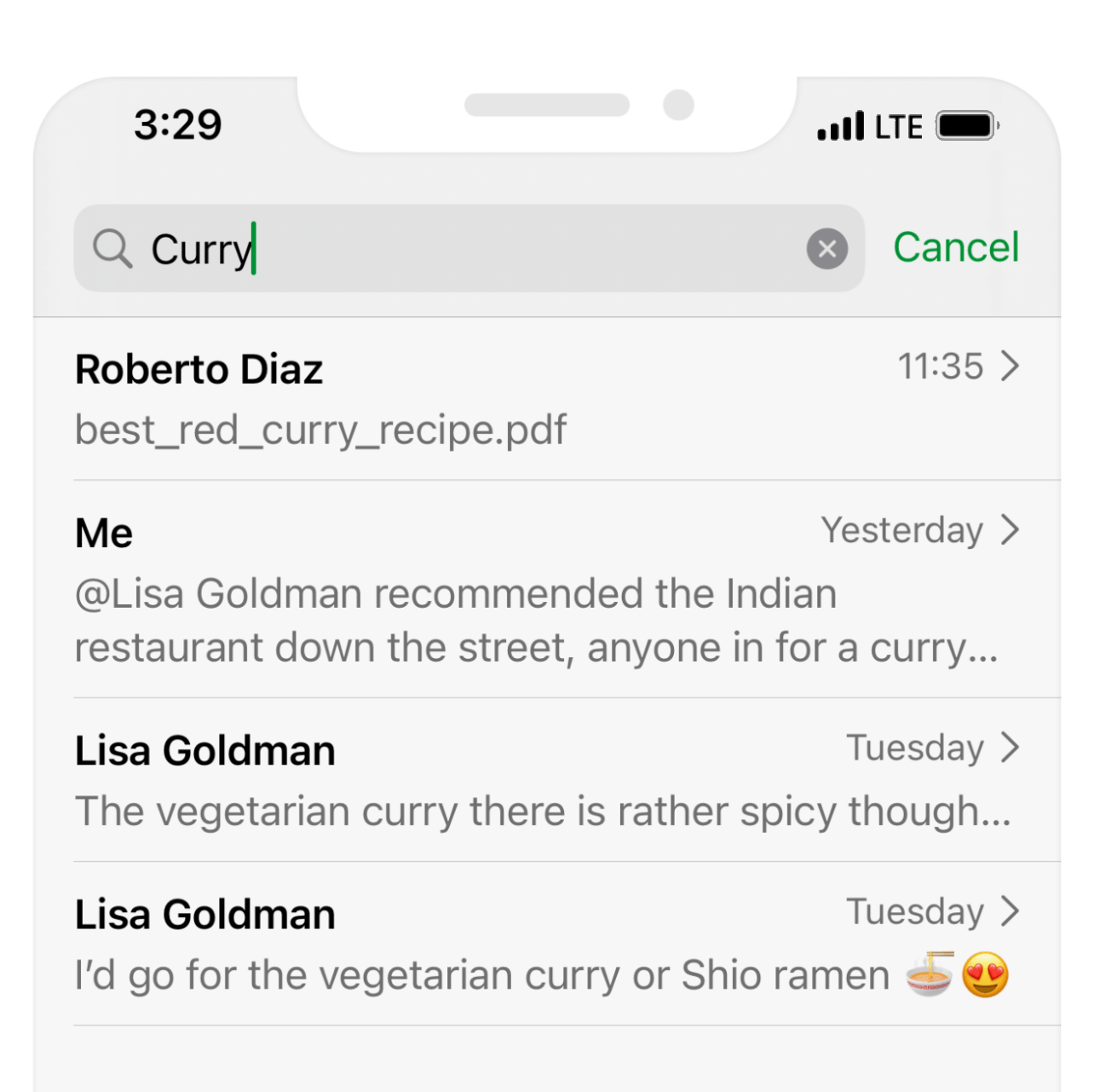
You can display the remaining time by tapping on the elapsed time (and vice versa). - When searching for a keyword in a chat, the results are now displayed in a neat list.
- Tapping “Load Earlier Messages” when scrolling through chats is a thing of the past: if you scroll up, messages will now load automatically.
- The time stamp and status of a message will now be displayed inside the message bubble. Subsequent messages are grouped if they’re sent in quick succession.
- Media and files can be now be viewed while the sending process is ongoing.
- You can now access the message details by swiping left on a message.
- In group messages, the members’ names are now displayed in different colors.
- There’s a live preview of text formatting in the text input field.
- The new camera icon next to the text input field allows you to take and send photos on the fly.

